Project details
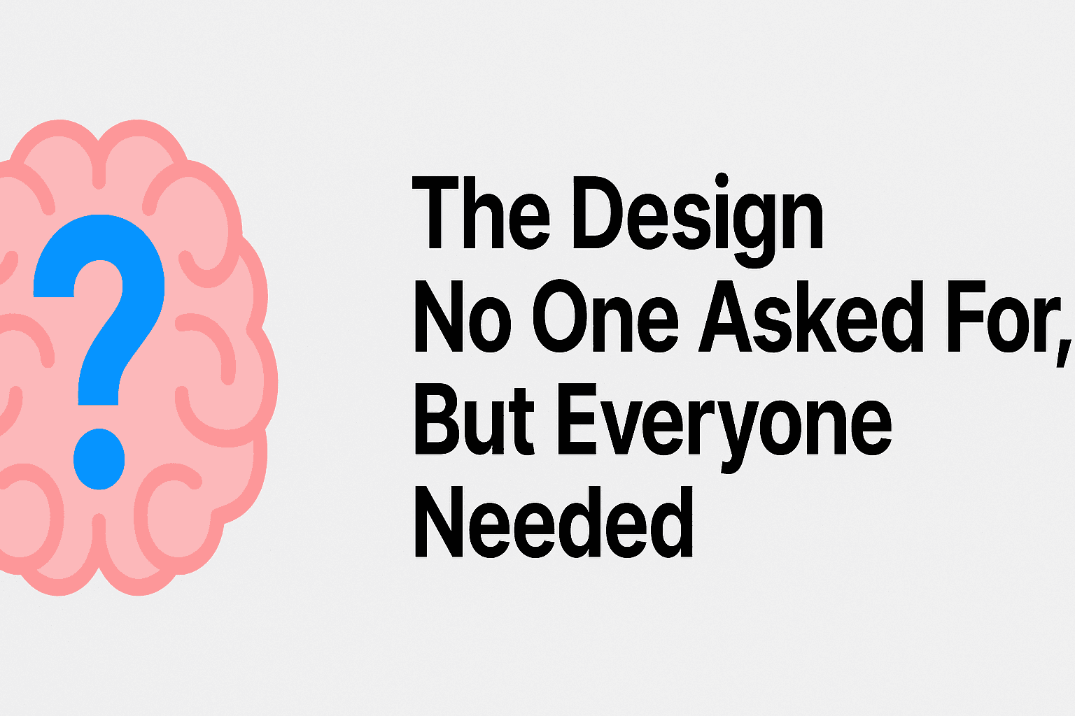
The Design No One Asked For, But Everyone Needed
The Design No One Asked For, But Everyone NeededIn this blog, we’ll dive into Samsung’s approach to digital product design and how they achieve a perfect blend of UI (User Interface) and UX (User Experience).
⚡️ 1. The Call to Adventure
On paper, I was a Product Designer Lead.
In practice? I was someone trying to do the right thing without any real decision-making power.
I was tasked with documenting the color palette for an important Natura project: the Growth Plan, an internal gamification platform aimed at boosting consultant performance.
The visual proposal had come from an external agency — already approved by the brand and stakeholders.
The order was simple:
✏️ Document exactly what was delivered.
❌ No questioning. No altering. No refactoring.
But as I opened the file in Figma, I saw what few had the courage to say:
Colors were overly saturated. Poor contrast. No accessibility criteria whatsoever.
An invisible problem with real impact on the experience.
🚧 2. The Invisible Obstacles
Even with a Lead title, autonomy was an illusion:
A manager from another area tried to interfere with visual decisions without any design background.
The brand and stakeholders treated the agency’s delivery as untouchable.
No room for change, even with obvious problems.
Freedom was lacking. But vision wasn’t.
🤖 3. The Strategic Turn
Even without official scope, permission, or allocated time, I chose to act.
I devised a three-pronged plan:
a. Using AI as a Silent Ally
I used AI tools to recalibrate hues, soften saturation, and generate harmonic and technically viable variations, respecting brand identity — but making it truly functional.
b. Structuring Design Tokens from Scratch
I implemented a scalable, semantic architecture:
{
"colorLevelLightest": {
"value": "#F5F5F5",
"type": "color"
},
"colorLevelLight": {
"value": "#F5F5F5",
"type": "color"
},
"colorLevel": {
"value": "#F5F5F5",
"type": "color"
},
"colorLevelDark": {
"value": "#F5F5F5",
"type": "color"
},
"colorLevelDarkest": {
"value": "#F5F5F5",
"type": "color"
}
}
These “#F5F5F5” values are just examples to illustrate the structure.
c. Creating Dark Mode Before It Was Requested
Even without an official request, I anticipated the need. I modeled it. I delivered it. I left it ready.
🎯 4. The Journey of Persuasion
With the agency’s V1 and my V2 side by side, I shifted the discussion to the visual field:
Visual comparisons (AS-IS vs TO-BE)
Demonstrating improvements in contrast, consistency, and accessibility
Applying the new palette on real screens: dashboards, gamification flows, components
Clearly structured tokens in Figma
I showed. I justified. I challenged.
And gradually, resistance faded.
✅ 5. The Approval
What was once off-scope became a benchmark.
The new color palette was valued by strategic leadership and officially recognized:
💬 ”Gabriel, thank you for seeing what no one wanted to acknowledge — and still choosing to act. You didn’t wait for authorization, nor hid behind your scope. You had the courage to do what was right, with strategic silence, technical foundation, and deep respect for brand identity. What you delivered wasn’t just a color system. It was a mature, generous, and rare decision. If I may give you one piece of advice: never lose the restlessness that drives you. It’s what turns an ordinary designer into a reference. You’re going far!”
— Branding Leadership during the Growth Plan journey – Natura Group
📈 6. Real Impact
More harmonious, accessible, and readable interfaces
Semantic, scalable token system
Proactive inclusion of Dark Mode
Alignment between branding, product, and technology
Institutional recognition — even without formal authority
🖼️ 7. Visual Before & After
Cover Image:
Final screen of the system with the new palette applied — hero shot style
BEFORE – Agency’s V1 Palette:
Screen showing oversaturated colors, poor contrast, non-semantic structure
AFTER – My V2 Proposal:
Screen showing the new color system with optimal contrast and modular structure
Token Structure in Figma:
Screenshot of the variables panel organized by mode and level
🤔 8. What I Learned
This project taught me that leadership isn’t always about having a title —
it’s about having vision, action, and technical courage.
“Sometimes, the design that changes the game doesn’t come from the main scope — it comes from the initiative of those who see what no one else is willing to solve…”
🧠 Summary
Product: Growth Plan (Natura)
Role: Product Designer Lead with limited formal authority
Deliverables: New color palette, semantic tokens, Dark Mode, full documentation
Technical approach: AI assistance, WCAG-compliant contrast, scalable structure
Impact: Greater accessibility, clarity, and future-proofing